bkercso
Fractal Lover

Posts: 220
|
 |
« Reply #45 on: November 24, 2012, 07:24:30 PM » |
|
I've done a little experiment with Img #6: Every time when I set initial conditions (remember: theta2_initial changes along x-axis) - I calculated H0 (initial energy), - set theta2_initial=Const*theta2_initial - and calculate omega2 for same H0 (omega2 is the angular speed of lower pendulum) Img#6 (original) m1=2, m2=1, L1=L2=1, theta1_initial=0, dt=1.9E-4 x-axis: theta2_initial=0..179 deg y-axis: theta2 when omega1=0 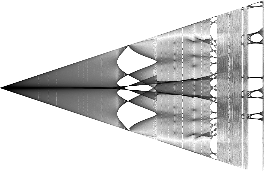 Axis are linear and like as @Img #6. Img #11 Const=0.5 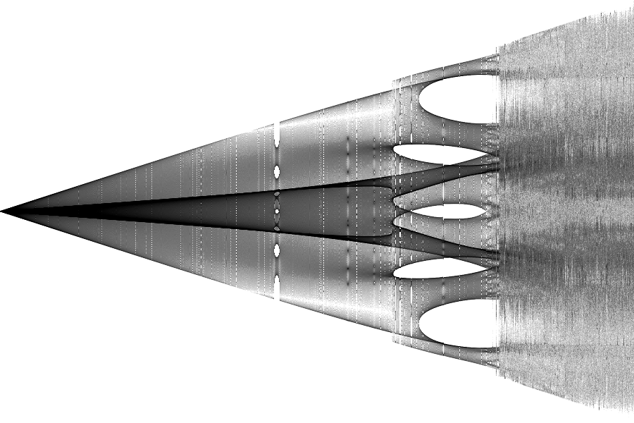 Img #12 Img #12 Const=0.15 You can see in this picture that you can put high energy into the system without chaotic (and periodic?) motion if theta2_initial is small. 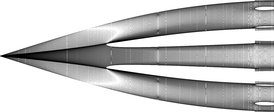 |
|
|
|
« Last Edit: May 27, 2015, 04:09:34 PM by bkercso »
|
 Logged
|
|
|
|
bkercso
Fractal Lover
Posts: 220
|
|
« Reply #46 on: November 25, 2012, 02:34:14 AM » |
|
I recalculated Img #6's calculation and plotted with different rendering criterion: m1=2, m2=1, L1=L2=1, theta1_initial=0, dHavg_target=1E-11, dt_min=1.5E-4 x-axis: theta2_initial=0..179 deg (log allocation) y-axis: beta2 when beta1=0 (betas are angular accelerations) Average 12 points/pixel. I left the first 10% of points. dHavg_target=1E-11 is high a little bit even at this low points/pixel rate: image quality in the two white ellipses are poor, blurred. Calculation time: 14 hours @3GHz Img #13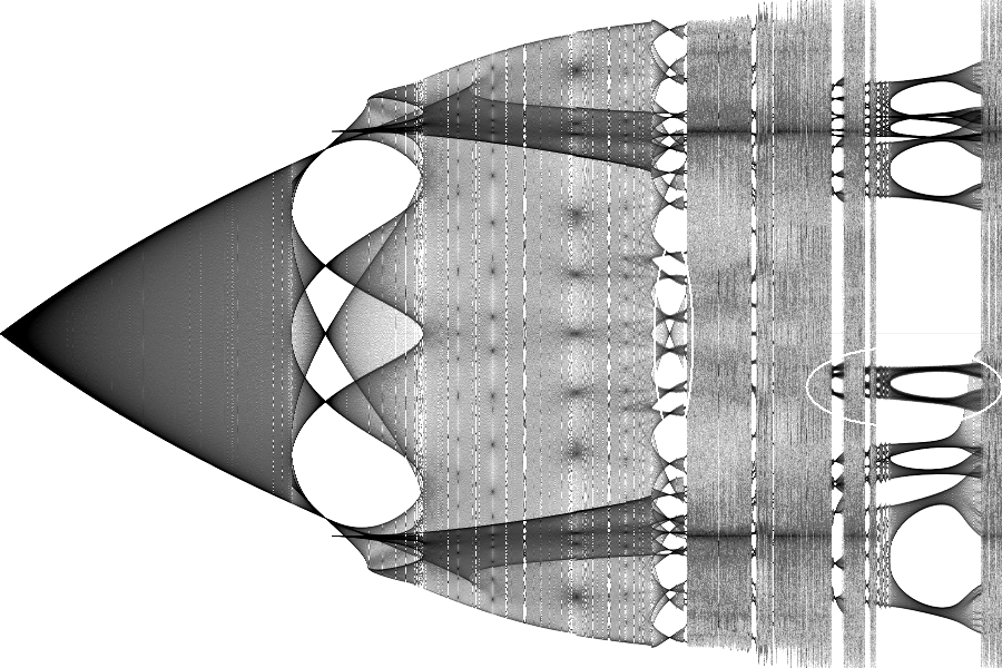 |
|
|
|
« Last Edit: May 27, 2015, 04:10:26 PM by bkercso »
|
Logged
|
|
|
|
Mrz00m
Fractal Lover
Posts: 204
|
|
« Reply #47 on: November 25, 2012, 12:48:02 PM » |
|
I found that it was possible to make an image exactly like the 1st one posted on the thread using a sound wave. I have a program that plots a wave on the graph as it is played 44,000 times a every second,
|
|
|
|
|
Logged
|
|
|
|
Mrz00m
Fractal Lover
Posts: 204
|
|
« Reply #48 on: November 25, 2012, 12:54:50 PM » |
|
I discovered an image like this , exactly like the 1st one on the thread, with an audio program which was plotting a graph of the sound 44,000 times a second, I had the loop in the sound, delayed by one sound sample, which sent a highly distorted and filtered high-frequency version of the wave back into itself, I think perhaps controlling the frequency modulation or something, anyway when I played with different settings it plotted a graph exactly like the 1st one here! the beginning of the wave was a regular low-frequency line, and asked the line progressed increasing numbers of high frequency feedback chaos lines forked off of each other in other words the wave was changing exponentially more in the middle of the graph and becoming regular at the end again.fun!
|
|
|
|
|
Logged
|
|
|
|
|
kram1032
|
|
« Reply #49 on: November 25, 2012, 01:55:38 PM » |
|
Hmm... upon looking back at the origins of this thread, I saw again the colored versions of the images and when I saw your inclusions of the early iterations as red, I was reminded of the "spectal" Buddhabrot, this forum has spawned a while back. Do you think you could try to do one of those? Like, add up the per-iteration results not directly as exposures but rather as varying wavelengths of light. The spectral buddhabrot had two really nice features: It really looked like all the different buddhabrots you get for different iteration-dephts across the used interval and it had the apprearance of a thin oil-film on water or a soap-bubble. Potentially, besides being really pretty, it might also give you some unexpected insight into the structure of the noisy/blurry parts. 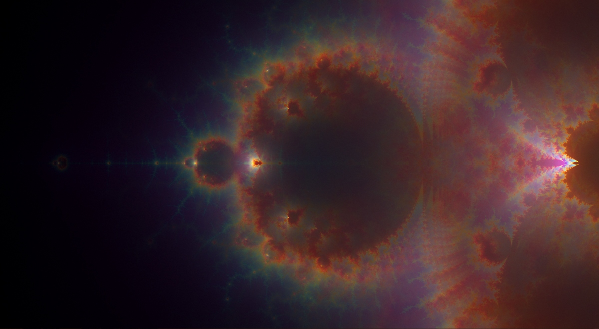 (by cbuchner1 found here, however that wasn't the first time this technique got used. I'm not sure who did the first render as I am unable to rediscover the corresponding thread) |
|
|
|
« Last Edit: November 25, 2012, 02:03:14 PM by kram1032 »
|
Logged
|
|
|
|
bkercso
Fractal Lover
Posts: 220
|
|
« Reply #50 on: November 25, 2012, 09:09:57 PM » |
|
I discovered an image like this , exactly like the 1st one on the thread, with an audio program which was plotting a graph of the sound 44,000 times a second, I had the loop in the sound, delayed by one sound sample, which sent a highly distorted and filtered high-frequency version of the wave back into itself, I think perhaps controlling the frequency modulation or something, anyway when I played with different settings it plotted a graph exactly like the 1st one here! the beginning of the wave was a regular low-frequency line, and asked the line progressed increasing numbers of high frequency feedback chaos lines forked off of each other in other words the wave was changing exponentially more in the middle of the graph and becoming regular at the end again.fun!
Pictures please!  |
|
|
|
|
Logged
|
|
|
|
bkercso
Fractal Lover
Posts: 220
|
|
« Reply #51 on: November 27, 2012, 04:04:09 AM » |
|
Hmm... upon looking back at the origins of this thread, I saw again the colored versions of the images and when I saw your inclusions of the early iterations as red, I was reminded of the "spectal" Buddhabrot, this forum has spawned a while back.
Do you think you could try to do one of those? Like, add up the per-iteration results not directly as exposures but rather as varying wavelengths of light.
The spectral buddhabrot had two really nice features: It really looked like all the different buddhabrots you get for different iteration-dephts across the used interval and it had the apprearance of a thin oil-film on water or a soap-bubble.
Potentially, besides being really pretty, it might also give you some unexpected insight into the structure of the noisy/blurry parts.
I comprehend what you talked about just now. I'm thinking about this, thank you. It might be a very good idea! Blurry parts are interesting. I'm playing with Poincaré-sections from chaotic regions and for example @dHavg=1E-13 these are contoured while bifurcation diagram aren't. But I have to do more iterations and higher quality- and more images... Maybe these are not blurry but too complicated for this horizontal resolution? |
|
|
|
« Last Edit: November 27, 2012, 04:59:31 AM by bkercso »
|
Logged
|
|
|
|
bkercso
Fractal Lover
Posts: 220
|
|
« Reply #52 on: November 27, 2012, 01:49:45 PM » |
|
I recalculated Img #3: m1=m2=1, L1=L2=1, theta1_initial=0, dHavg_target=1E-13, dt_min=3E-6 x-axis: theta2_initial=0..179.9 deg y-axis: theta2 when omega1=0 Average 60 points/pixel (!), 2 Mpixels. I left the first 5% of points. Calculation time: 8 days @12*2.67GHz (!) Img #14The vertical widenings around the second trisect point of x-axis are not from first iterations as I assumed before, there is a chaotic region with slow quasi-periodic to chaotic transition. And yes, the 947th, 959th, 971th and 1800th pixel columns are missed, all white. Coding error: at this point I had to restart the calculation to continue (machiene turned off). 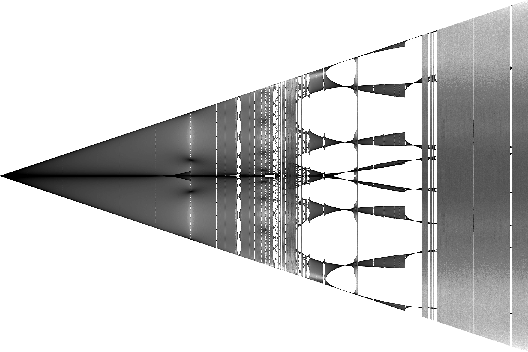 Here it is in twice vertical resolution (average 30 points/pixel), without optimized contrast.  |
|
|
|
« Last Edit: May 27, 2015, 04:12:50 PM by bkercso »
|
Logged
|
|
|
|
bkercso
Fractal Lover
Posts: 220
|
|
« Reply #53 on: November 30, 2012, 04:30:28 PM » |
|
A can't stop generating images, altough they are quite similar to each other. In this new one I plotted theta2/theta2_initial normalized values instead of theta2 values. This normalization fitted the fractal to image area, and you already can see the quasi-periodic patterns even at low initial displacements. The environments of the two biggest "black point" are also good observable. m1=10, m2=1, L1=1, L2=10, theta1_initial=0, dHavg_target=1E-13, dt_min=3E-5 x-axis: theta2_initial=0..150 deg (log. allocation) y-axis: theta2 when omega1=0 Average 10 points/pixel, 1.5 Mpixels. I left the first 10% of points. Calculation time: 40 hours @2.5GHz Img #15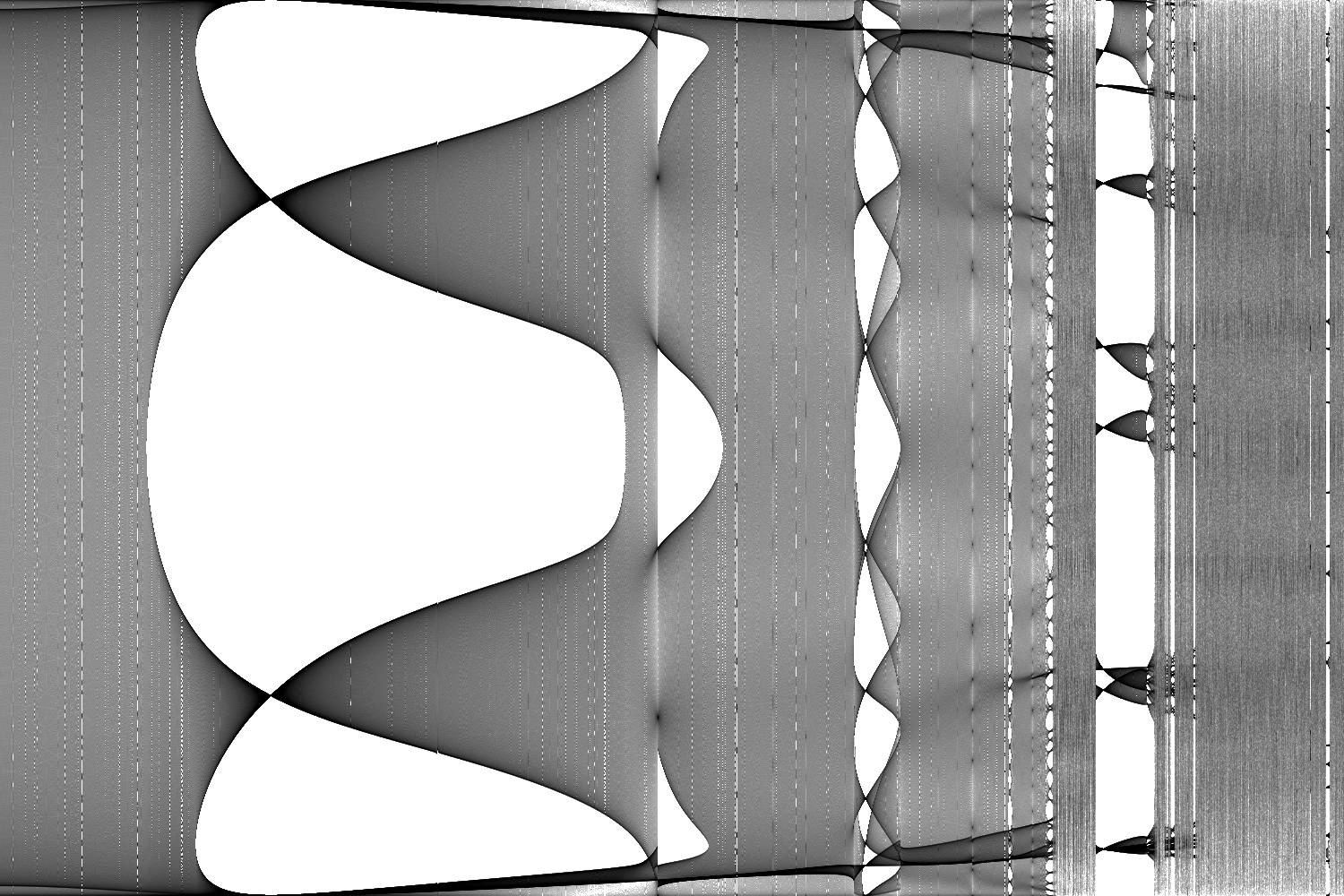 |
|
|
|
« Last Edit: May 27, 2015, 04:13:18 PM by bkercso »
|
Logged
|
|
|
|
|
kram1032
|
|
« Reply #54 on: November 30, 2012, 05:51:33 PM » |
|
Yeah, well maybe you'll reveal something new once you get to the wavelength mapping.
Still, you did reveal some beautiful patterns.
|
|
|
|
|
Logged
|
|
|
|
|
cKleinhuis
|
|
« Reply #55 on: November 30, 2012, 05:54:37 PM » |
|
one question i have
what does the density mean ??!
i mean the density is stronger at the upper and lower ends of the streaks, in between it is more light, does it mean that such events are more likely to happen !? at the exact upper and lower ends of a branch ?
|
|
|
|
|
Logged
|
---
divide and conquer - iterate and rule - chaos is No random!
|
|
|
|
kram1032
|
|
« Reply #56 on: November 30, 2012, 09:49:22 PM » |
|
the denser, the more often that place gets "hit" by what ever process is used for any given bifurcation diagram.
It must be that extreme values are hit more often than in-between ones.
I'm not sure if that's an accurate explanation but if you think of a typical sine-wave-trajectoiry-density of a simple harmonic oscillator, you'll find a similar increase in density towards the endges, due to change in velocity.
It'll slow down at the edges, thus creating more apparent density when averaged over all times, while it'll speed up at the point of stable equilibrium where velocity is maximized, resulting in reduced time-averaged density.
Since these bifurcation diagrams basically plot trajectories over time, they approach that same time-average.
|
|
|
|
|
Logged
|
|
|
|
|
cKleinhuis
|
|
« Reply #57 on: November 30, 2012, 11:14:42 PM » |
|
hmm, thinking of the book hitchickers guide to galaxy, is this an indicator for the possibilty of events ?!
i mean, the more dense, the more possible an event is ?! considering the chaotic behaviour would this
be a hint for the possibilities of an event ?!
|
|
|
|
|
Logged
|
---
divide and conquer - iterate and rule - chaos is No random!
|
|
|
bkercso
Fractal Lover
Posts: 220
|
|
« Reply #58 on: December 01, 2012, 12:00:44 AM » |
|
Yeah, well maybe you'll reveal something new once you get to the wavelength mapping.
I'm thinking about for what I can base wavelength changeing, for what physical quantity. Since these bifurcation diagrams basically plot trajectories over time, they approach that same time-average.
Not exactly, these diagrams don't based on trajectories - unfortunately. If would be then I would get several points during one oscillation of the pendulum. But I get only 1 or 2, because I get a point only when the movement meet to the rendering criterion (for example when the angular speed of the upper pendulum is zero). Where the image is darker there are more points. Higher probability? We can say that but this is a deterministic system not a random one. Because of that the geometry- and color patterns are really very interesting for me. The common thing in most of biurcation diagrams of double pendulum that there is a double dark band. At some systems they are close to each other (Img #3), at other systems they are moving away from each other with higher theta2_initial (Img #4). I would say that the dark bands and dark points are attraktors of the given system. |
|
|
|
« Last Edit: December 01, 2012, 01:12:05 AM by bkercso »
|
Logged
|
|
|
|
|
kram1032
|
|
« Reply #59 on: December 01, 2012, 02:27:35 AM » |
|
I thought of mapping the wavelength simply to time, e.g. to iteration depth.
An alternate form might be to map it to orbit length if you keep track of that.
|
|
|
|
|
Logged
|
|
|
|
|


